Comparing Social Risk Measures in California
California uses three measures to assess different components of social risk, although they do so in distinct ways.
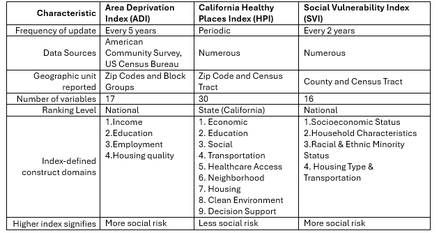
Healthy Places Index (HPI) is a strength-based measure with the greatest number of variables but is only computed for California and is not regularly updated. The healthier the place, the higher the index.
Area Deprivation Index (ADI) focuses on economic indicators. The more economic deprivation an area has, the higher the index.
Social Vulnerability Index (SVI) provides a wider range of domains than ADI, as it includes additional demographic variables. The more social vulnerability, the higher the index.
Summary of Characteristics
Indexes vary in their construction by geography, domains, and variables. The ADI reports the most granular geographic unit (block groups). Large geographic units may mask variation within the community, whereas small units may have large confidence intervals (or not be computed at all, as in the case of HPI).
HPI and SVI Analysis
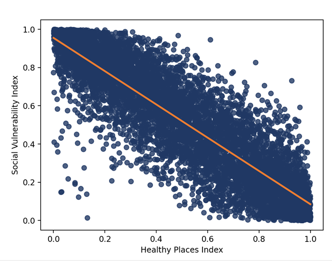
HPI is inversely correlated with SVI – higher HPI values signify a healthier community, while a higher value on the SVI indicates greater vulnerability. Therefore, a higher HPI score is associated with lower social vulnerability and vice versa.
SVI was calculated for census tracts excluding those with insufficient census data.
The graph demonstrates the variation in their association at the census tract level. The data show a linear relationship, but the distance from the line indicates how much they co-vary. Part of these differences are explained by the domains that are included in each index. For example, race and ethnicity are not an input for the HPI. This highlights an important policy consideration about which attributes make sense to include in the measurement of a community’s social risk versus those that make sense to incorporate through additional analysis. In this case, HPI can be stratified by racial and ethnic composition to understand how they relate to communities’ health status. On the other hand, SVI includes those variables in the index, which means they are considered an indicator of a community’s social vulnerability.
HPI and ADI Analysis
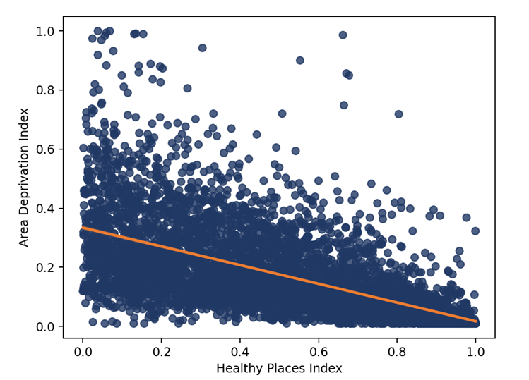
As with SVI, the relationship between ADI and HPI is inverse – higher HPI values should be associated with lower SVI values.
HPI is calculated at the zip code and census tract levels. It excludes census tracts with populations of 1500 or fewer residents and tracts where the proportion of those living in group quarters represents 50% or more of the total population. HPI bases these decisions on the 5-year annual average estimates of the American Community Survey, 2015-2019.
In contrast, ADI is calculated for zip codes and block groups. It excludes block groups with less than 30 housing units, 100 people, and/or more than one-third of the population residing in group quarters. To facilitate index comparisons, the ADI was aggregated from block group to census tract using population-weighted means to match the HPI unit of analysis.
HPI and ADI are less correlated than HPI and SVI. Additionally, the variation is more significant, with the direction of indices not always matching. These differences represent the differences in the domains included in each index. ADI focuses on socioeconomic factors, whereas HPI takes a broader look at communities’ relative health.
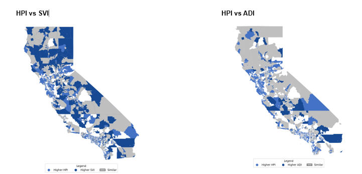
Comparative Maps
Each map depicts a difference between HPI and an alternate index (i.e., SVI or ADI). Census tracts displayed in gray indicate relative agreement between HPI and the index – meaning that they are within ±0.2 percentage points of one another. Census tracts in light blue indicate a higher HPI – meaning that the HPI index is more than 0.2 percentage points higher than the comparison indicator. Conversely, dark blue tracts indicate the HPI is more than 0.2 percentage points lower than the comparison index. For example, if the HPI were 1.8 and the SVI was 1.0, the HPI would be higher by 0.8 percentage points – meaning it would appear in light blue on the map. Tracts appearing in white mean HPI are not computed due to their size of composition.